Luno
Onboarding, B2B, Support, & Security
My time at Luno spans building 0→1 B2B products, redesigning support journeys people were actively struggling with, and shipping self-serve security features that stopped customers from losing control of their account funds
Luno
Onboarding, B2B, Support, & Security
My time at Luno spans building 0→1 B2B products, redesigning support journeys people were actively struggling with, and shipping self-serve security features that stopped customers from losing control of their account funds
Luno
Onboarding, B2B, Support, & Security
My time at Luno spans building 0→1 B2B products, redesigning support journeys people were actively struggling with, and shipping self-serve security features that stopped customers from losing control of their account funds
Jump to a project
Jump to a project
In my time at Luno:
In my time at Luno:
I refined onboarding and KYC for retail customers, built some of Luno's first 0→1 B2B products, optimised costly customer support journeys, and prevented account takeovers through security-led, self-service design solutions.
I refined onboarding and KYC for retail customers, built some of Luno's first 0→1 B2B products, optimised costly customer support journeys, and prevented account takeovers through security-led, self-service design solutions.
My role trajectory:
My role trajectory:
I was promoted from "associate product designer" to "product designer" during my tenure at Luno, as of 2026 my title has shifted to UX designer along with my peers, highilghting a more research & impact centric aspect to my role.
I was promoted from "associate product designer" to "product designer" during my tenure at Luno, as of 2026 my title has shifted to UX designer along with my peers, highilghting a more research & impact centric aspect to my role.
My key takeaways:
My key takeaways:
Working across so many parts of Luno gave me a rare view of how support, product, and security decisions connect. I learned that some of the most valuable UX work often lies outside of a designer's typical scope.
Working across so many parts of Luno gave me a rare view of how support, product, and security decisions connect. I learned that some of the most valuable UX work often lies outside of a designer's typical scope.
Deceased Estates
Designed a more cost effective & accessible journey for executors & family to report, manage, & close the account of a deceased customer
IMPACT made
IMPACT made
Reduction in ticket turnaround time (7.4→3.2 over 2 months)
Reduction in requestor wait time overall (6.5→1.9 over 2 months)
Reduction in average ticket volumes (64→51 over 2 months)
Positive sentiment on executor sentiment CSAT form responses
Notifying Luno of a deceased customer took over a week of back-and-forth between grieving families and support agents. Executors were forced to engage in bureaucratic processes that were needlessly long-winded and did not surface their immediate needs.
About the project:
About the project:
I was brought in as the product designer to fix this previously disjointed journey; it was my mission to ensure a positive and cohesive experience across Luno, even for non-customers.
Gathering documents, notifying Luno, and completing asset allocation forms were three disconnected steps handled by executors, while support agents had no shared visibility on ticket progression, which drove up ticket handling time costs greatly.
My job was to facilitate internal and external participant collaboration and improve the key support mechanisms that previously left both internal and external parties directionless.
I was brought in as the product designer to fix this previously disjointed journey; it was my mission to ensure a positive and cohesive experience across Luno, even for non-customers.
Gathering documents, notifying Luno, and completing asset allocation forms were three disconnected steps handled by executors, while support agents had no shared visibility on ticket progression, which drove up ticket handling time costs greatly.
My job was to facilitate internal and external participant collaboration and improve the key support mechanisms that previously left both internal and external parties directionless.
Impact & outcomes:
Impact & outcomes:
I redesigned the internal ticket handling system to improve knowledge transfer between support agents, and rebuilt the external-facing articles, forms, and email copy for executors to handle their deceased estate requests efficiently.
Previously, executors would open a request before they knew what documents they required, and agents picking up a reassigned ticket had to read back through up to 5 other tickets to understand what was still outstanding.
The redesign cut average ticket turnaround time from 7.4 to 3.2 days over two months, a 56% reduction that slashed the typical time and cost of a deceased estate issue.
I redesigned the internal ticket handling system to improve knowledge transfer between support agents, and rebuilt the external-facing articles, forms, and email copy for executors to handle their deceased estate requests efficiently.
Previously, executors would open a request before they knew what documents they required, and agents picking up a reassigned ticket had to read back through up to 5 other tickets to understand what was still outstanding.
The redesign cut average ticket turnaround time from 7.4 to 3.2 days over two months, a 56% reduction that slashed the typical time and cost of a deceased estate issue.
Learnings & next steps:
Learnings & next steps:
Getting executors to hold off on raising a ticket until they had every required document ready for the start of their support journey made more difference to the outcome than any individual form or article redesign.
A simple compliance and legal check showed me that there were no blockers in surfacing the documentation to executors this way, and it proved to be the most useful nugget of behavioural leverage in my toolkit over the course of this project.
All CSAT form responses from executors came back with only good reviews, a 100% positive sentiment on feedback regarding the deceased estates support journey.
Getting executors to hold off on raising a ticket until they had every required document ready for the start of their support journey made more difference to the outcome than any individual form or article redesign.
A simple compliance and legal check showed me that there were no blockers in surfacing the documentation to executors this way, and it proved to be the most useful nugget of behavioural leverage in my toolkit over the course of this project.
All CSAT form responses from executors came back with only good reviews, a 100% positive sentiment on feedback regarding the deceased estates support journey.
Research approach:
Research approach:
Early research showed that support agents were working blind on reassigned tickets and showed that executors were consistently unaware of what documentation was required until a support agent told them what to provide as legal proof to succeed in their efforts. This was a massive time sink for both parties.
Considered: Leaving the ticket system as-is and focusing only on external-facing documentation.
Rejected because: the internal communication gap was the larger driver of turnaround time — fixing only the external side would have left agents still reconstructing context on every handoff.
Chose: A comprehensive, visible internal record of what had been submitted by an executor, prompted by each support agent internally via ZenDesk, paired with a fully unhidden external documents list so executors stopped repeating themselves across email threads.
Early research showed that support agents were working blind on reassigned tickets and showed that executors were consistently unaware of what documentation was required until a support agent told them what to provide as legal proof to succeed in their efforts. This was a massive time sink for both parties.
Considered: Leaving the ticket system as-is and focusing only on external-facing documentation.
Rejected because: the internal communication gap was the larger driver of turnaround time — fixing only the external side would have left agents still reconstructing context on every handoff.
Chose: A comprehensive, visible internal record of what had been submitted by an executor, prompted by each support agent internally via ZenDesk, paired with a fully unhidden external documents list so executors stopped repeating themselves across email threads.
Validation approach:
Validation approach:
This journey involved sensitive legal information that could not be tested with external users.
My team and I had strong conviction that the multi-approach solution would shave a meaningful amount of friction off each step, which would result in a collectively impactful improvement to the deceased estates support journey.
With that in mind, the dual-sided design was validated directly through the resulting metrics.
Both the internal turnaround time and the external wait time dropped together, confirming the two sides of the journey were genuinely linked rather than independent problems.
This journey involved sensitive legal information that could not be tested with external users.
My team and I had strong conviction that the multi-approach solution would shave a meaningful amount of friction off each step, which would result in a collectively impactful improvement to the deceased estates support journey.
With that in mind, the dual-sided design was validated directly through the resulting metrics.
Both the internal turnaround time and the external wait time dropped together, confirming the two sides of the journey were genuinely linked rather than independent problems.
The Updated journey
The Updated journey
The first touchpoint:
This article is one of two articles that explain how executors can successfully report a deceased Luno customer and reallocate their assets.
The problems solved:
Required documentation info is listed per region.
Instructions to gather documents before notifying.
Each button populates the region in the next step.

The third touchpoint:
An auto email reply is sent to the executor to acknowledge the connection prompted in the form and to assist in further detailing the process to come.
The problems solved:
Expectations are set upfront to ensure that executors are aware of all outcome possibilities.
A backlink to the article can be found in the email, helping executors find necessary info again quickly.

The second touchpoint:
The "Notify Us" form is where executors prompt the customer support team, establishing the first contact point that will help them solve their problem.
The problems solved:
All info that can be pre-populated is filled into the form when the article buttons are selected.
A documentation list reminder is accessible to reduce the need for backtracking.

The final touchpoint:
Once all documentation is supplied satisfactorily, the executor is provided with an asset allocation form to help Luno move the deceased's funds.
The problems solved:
Internal document notes are set up for internal teams to understand what to populate before they send the form off to be completed by the executor, no more duplication of unnecessary assets.

The first touchpoint:
This article is one of two articles that explain how executors can successfully report a deceased Luno customer and reallocate their assets.
The problems solved:
Required documentation info is listed per region.
Instructions to gather documents before notifying.
Each button populates the region in the next step.
The second touchpoint:
The "Notify Us" form is where executors prompt the customer support team, establishing the first contact point that will help them solve their problem.
The problems solved:
All info that can be pre-populated is filled into the form when the article buttons are selected.
A documentation list reminder is accessible to reduce the need for backtracking.
The third touchpoint:
An auto email reply is sent to the executor to acknowledge the connection prompted in the form and to assist in further detailing the process to come.
The problems solved:
Expectations are set upfront to ensure that executors are aware of all outcome possibilities.
A backlink to the article can be found in the email, helping executors find necessary info again quickly.
The final touchpoint:
Once all documentation is supplied satisfactorily, the executor is provided with an asset allocation form to help Luno move the deceased's funds.
The problems solved:
Internal document notes are set up for internal teams to understand what to populate before they send the form off to be completed by the executor, no more duplication of unnecessary assets.
The first touchpoint:
This article is one of two articles that explain how executors can successfully report a deceased Luno customer and reallocate their assets.
The problems solved:
Required documentation info is listed per region.
Instructions to gather documents before notifying.
Each button populates the region in the next step.
The second touchpoint:
The "Notify Us" form is where executors prompt the customer support team, establishing the first contact point that will help them solve their problem.
The problems solved:
All info that can be pre-populated is filled into the form when the article buttons are selected.
A documentation list reminder is accessible to reduce the need for backtracking.
The third touchpoint:
An auto email reply is sent to the executor to acknowledge the connection prompted in the form and to assist in further detailing the process to come.
The problems solved:
Expectations are set upfront to ensure that executors are aware of all outcome possibilities.
A backlink to the article can be found in the email, helping executors find necessary info again quickly.
The final touchpoint:
Once all documentation is supplied satisfactorily, the executor is provided with an asset allocation form to help Luno move the deceased's funds.
The problems solved:
Internal document notes are set up for internal teams to understand what to populate before they send the form off to be completed by the executor, no more duplication of unnecessary assets.
Reworking both internal and external sides of the journey together was the key to solving the core problem with the existing journey. Influencing behaviour intentionally, providing information upfront, and facilitating better internal communication is what slashed ticket turnaround times in half. Support agents stopped reconstructing context from scratch on every handoff, and executors stopped repeating themselves across email threads. Everyone ended up happier after launching the solution!
In hindsight, I wish I had set up more accessible and robust data dashboards to visualise the performance of deceased estates issues. Attributing solution success to any meaningful change in data was tough; the wait time was too long to see immediate impact.
Key steps & outcomes
Key steps & outcomes
Led multifaceted improvement to articles, forms, documents, and internal communications
Redesigned journey touchpoints to influence executor behaviours and curb early ticket creation
Implemented new internal ZenDesk macros to ensure quick ticket turnaround times
Engaged directly with key stakeholders and teams to ensure a rapid solution launch
Transactions Freeze
Designed an improved account transactions freeze feature that affords Luno customers a self-service solution to securing their funds
Currently in progress
•
Paused due to company restructure
•
Not yet launched
•
Luno had no self-serve way to freeze account activity if a customer suspected suspicious activity; the only options were the generic support form or disabling sends entirely via typically inaccessible links in transactional emails. I was brought in to design Luno's first self-service transaction freeze feature, built into the app. My vision for this feature was to ensure responsive surfacing of entry points based of customer behaviours, helping them find ways to secure themselves exactly where they need it most.on
The problem:
Today, a customer's first sign that something has gone wrong is usually a transaction notification email. From there, the only options are locking sends manually via an unassuming email footer link or filing a help centre report through typical reporting form channels. Both of these methods were cumbersome, inaccessible, and easy to miss under stress.
This is exactly the moment a customer is most likely to panic-sell or panic-withdraw, and the existing journey does nothing to intervene or provide alternatives that incur less cost for the customer and Luno.
I'd spent a year and a half working across Luno's support and security journeys, and this particular hidden "disable sends" workaround was one I ran into constantly. Seeing it finally scoped as a real feature was genuinely satisfying to work on.
Key decisions:
After conducting UX research, it became clear that only placing the freeze option in one settings menu was unfavourable; I mapped the feature to the behaviours that typically precede a security scare (removing trusted devices, repeated credential changes, or unusually large withdrawal attempts).
The feature now surfaces contextually in my latest designs, at the site of the customer's concern, instead of requiring them to already know where to look. I conducted usability testing which affirmed customers knew where to find the feature in an ideal signed-in state.
Terminology was the only outstanding variable in question. I tasked the UX writers on my team to run an A/B survey through Maze with 15 participants tested "freeze" against "lock". "Lock" tested worse, carrying a connotation of finality and lost control, while "freeze" felt familiar and lower-stakes, closer to language customers already knew from banking apps.
Key Validation metrics
Key Validation metrics
Usability test participants were all that I needed to validate my research assumptions
Terminology A/B test participants validated strong sentiment towards "Freeze" over "Lock"
4/5 participants were able to find the feature based on the usability test scenario parameters alone
legacy sends lock journey
legacy sends lock journey


rapid Discovery phase
rapid Discovery phase
Previous security features brainstormed with the greater UX design team
Defined core scenarios, like compromised security or lost account access
Pre research assumptions applied to ensure breadth of feature functionality
Defined the challenge, proposed solutions, and the problem statement
Outlined key customer archetypes to ensure I was in the customer's shoes
Business goals defined and mapped against key security success metrics
Competitor analysis completed, and favourable features were integrated into later ideation
Rough sticky note journeys mapped and fleshed out in higher fidelity formats
Ideating scenarios & the MVP journey
Ideating scenarios & the MVP journey


Fleshing out ideation with wireframes
Fleshing out ideation with wireframes


Latest design states
Latest design states
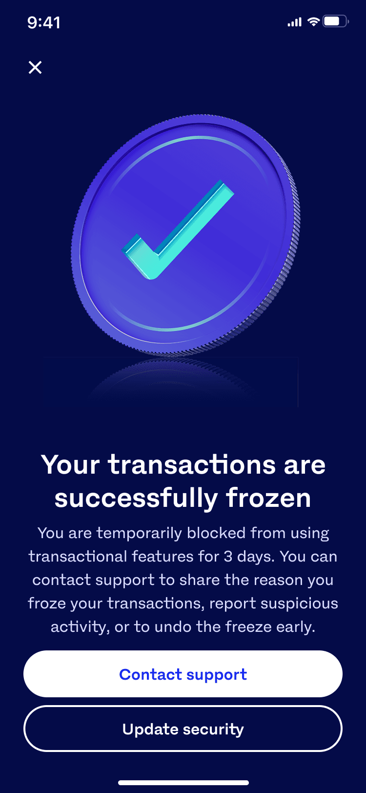
Transactions freeze happy path:
Transactions freeze happy path:


Post-freeze contact form:
Post-freeze contact form:


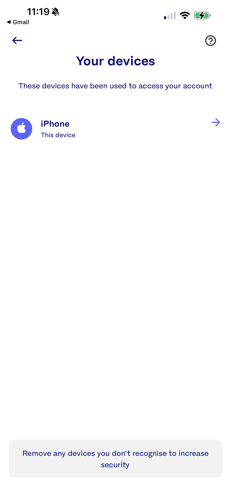
Multiple device removals surfacing the feature:
Multiple device removals surfacing the feature:


Un-freezing, communications, and feature education:
Un-freezing, communications, and feature education:


Where does the project stand today? It was paused when company priorities shifted during a restructure. A reality of shifting company focus that many are familiar with. I'd completed research, IA, wireframes, and partial UI for the signed-in and signed-out states, with cross-links mapped into security, support, and transaction flows. If this project resumes, and I intend to advocate that it does as soon as possible, the terminology and behavioural-trigger research is already validated and ready to build from.
Where does the project stand today? It was paused when company priorities shifted during a restructure. A reality of shifting company focus that many are familiar with. I'd completed research, IA, wireframes, and partial UI for the signed-in and signed-out states, with cross-links mapped into security, support, and transaction flows. If this project resumes, and I intend to advocate that it does as soon as possible, the terminology and behavioural-trigger research is already validated and ready to build from.
Business Account Onboarding
I designed and shipped the business accounts marketing website, along with the bulk of the onboarding journey before switching teams
Before this project, Luno onboarded business customers one at a time through white-glove relationship managers; there was no self-service path, and little public-facing information about the business offering. I led early-stage design, shaped the direction of the business marketing website, and the first version of the onboarding journey. I worked in an environment with almost no existing strategy, research access, or precedent to build from.
The problem:
Business customers trade at higher volumes and tend to be more resilient through market downturns than retail customers; a more diversified customer base means Luno can have a steadier revenue stream during tougher times.
But there was no infrastructure to support Luno, and no way for prospective business customers to learn about the offering or sign up without prompting a relationship manager to email them directly.
Key decisions:
I was barred from interviewing or surveying Luno's existing business customers for most of the ±2 years I was on the team, and external testing risked leaking proprietary roadmap information to competitors. I built up my understanding through competitor benchmarking on platforms like Mobbin and regular conversations with Luno's own relationship managers, who held the closest thing to direct customer insight available.
My direction was shaped primarily by compliance requirements and operations team input rather than direct customer validation tactics. In hindsight, I'd have pushed for structured internal interviews and surveys earlier; even without external customer access, there was more internal insight available than I initially tapped into.
What I learned:
This project moved through genuinely chaotic conditions: shifting stakeholder requirements, a moving strategic target, and team goals that changed month to month.
My biggest takeaway was that stability has to be established before a problem can become complex rather than chaotic.
Anchoring myself to core UX fundamentals is what makes that possible. I also learned to raise blockers earlier rather than trying to carry an ambiguous, large-scope project alone.
Where the project stands:
I handed the project off in a ready state after roughly 18 months, having shaped the information architecture, UI direction, and early onboarding flow.
A fellow design colleague picked it up and launched it around a year later in 2025; however, the launched version remained structurally close to where I left it. The business offering has since evolved significantly, moving toward institutional, OTC, and API-focused products.
Business marketing website iterations
Business marketing website iterations





select onboarding screen iterations
select onboarding screen iterations
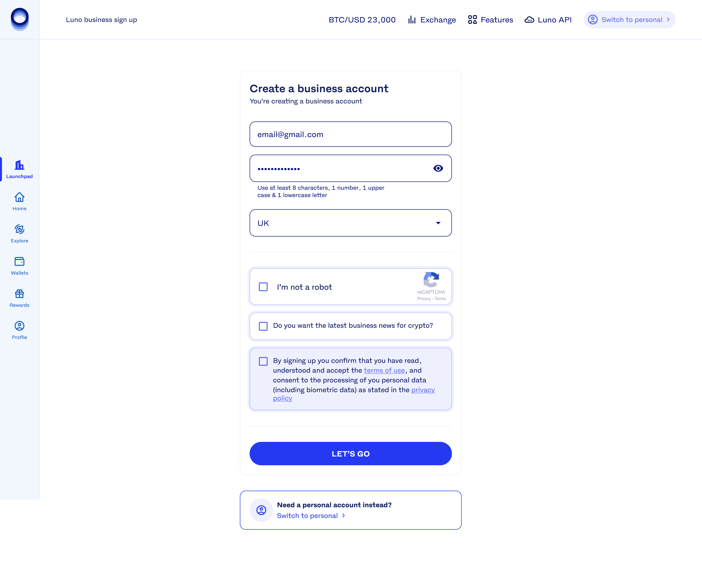
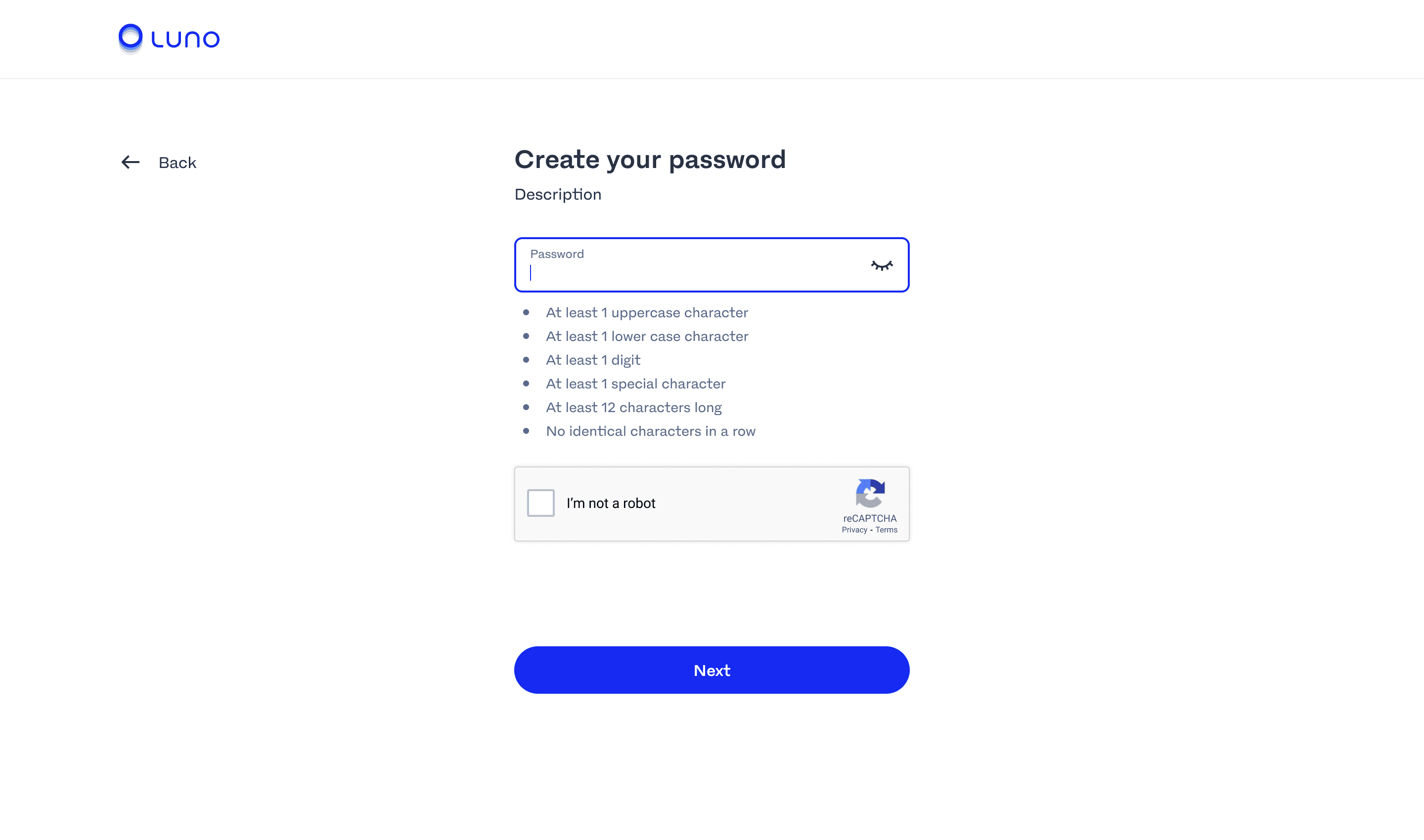
Business accounts sign up iterations:
Business accounts sign up iterations:



Business accounts eligibility checker iterations:
Business accounts eligibility checker iterations:


Given the chance, I would jump at the chance to work on this project again. Working with the business accounts team was a pleasure despite the chaotic and demanding nature of building a 0→1 project.
Given the chance, I would jump at the chance to work on this project again. Working with the business accounts team was a pleasure despite the chaotic and demanding nature of building a 0→1 project.