PlutoPay
Splitting costs with a tap
Most payment apps are built around institutions, not people. The challenge was designing a person-to-person payment experience simple enough to replace cash and tedious payment processes.

Project details:
Solo UX challenge · Responsive web app · Mar–Sep 2021 · Figma, InVision, UsabilityHub
My role:
I owned this project end-to-end: From UX research, product strategy, ideation, wire-framing, prototyping, and validation.
How do we make person-to-person payments feel as immediate as handing someone cash, without the friction that legacy banking infrastructure adds?
The problem:
Sending money to someone nearby, splitting a dinner bill, or settling costs across a group still requires adding recipients manually, navigating poorly built interfaces, and waiting on processes that assume that you have ample time to spare.
Discovery & design
Getting into the nitty gritty
Research approach:
I used a mixed-methods approach, using preference and Likert scale surveys to capture qualitative sentiment.
I followed the survey up with usability tests with low-fidelity wireframes for quantitative behavioural data.
SURVEY FORM
13 participants
USABILITY TEST
4 participants
Survey data:
Settled small debts through lengthy banking transfers
Used apps & online tools to transfer money every day
Prefer tapping their device or card as a payment method
Feel no loyalty to current cost splitting or payment methods
What changed driven by data:
Going in, I assumed loyalty to existing banking apps would be the primary barrier.
The data said otherwise: 47% felt no loyalty to current methods at all. The main point of friction was effort; 46% were still using lengthy bank transfers simply because fewer popular alternatives existed for small, person-to-person payments.
Usability testing:


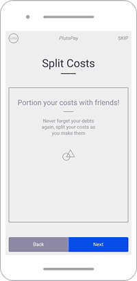
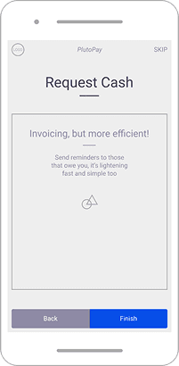


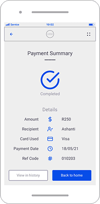




What the usability tests revealed:
Usability testing surfaced three consistent themes across all four participants: A need for assurance that money won't disappear, frustration with the effort of adding recipients, and a preference for simplicity over feature depth with an automation twist.
The overriding sentiment, people aren't loyal to current payment methods, they're just stuck with them.
Theme 1: Trust & Assurance:
People want proof their money is safe, alerts, and authentication were mentioned across all four participants. No one trusts a new financial app without visible safeguards.
Theme 2: Effort & Friction:
Adding recipients, switching between apps, and managing cross-bank compatibility was the single most cited annoyance. The bar for "easier" is low, people just want fewer steps.
Theme 3: Flexibility over precision:
The "I pay today, you pay tomorrow" behaviour signals people don't always want exact splits. They want options, not a rigid 50/50 split function.
These validated themes directly shaped who I was designing for, and what those people needed PlutoPay to do for them. I visualised this in a persona.

Lihle
30 · Partnered · Female (She/Her) · London · Magazine Rditor
Photo by Jeffery Erhunse on Unsplash
“I feel like I know about finances, but I’m not so sure that I know enough...”
Goals & Needs:
Wishes her forgetful friends would pay her back on time, and wants things to be faster.
Needs constant reminders on how to do finances; banks make things hard for her.
Wants to be able to regularly split costs with her girlfriend, since they share a flat.
Motivations:
Appreciates it when her friends and family offer help in handling her finances.
Appreciates minimal effort, she likes it when she can depend on regular behaviours.
Likes seeing all her financial assets in one place and having them clearly defined.
Behaviours:
Ashanti and her partner split everything: rent, amenities, food, and recreational costs.
Tends to struggle a little with finances, but does her research and gets the hang of it.
Blames herself for not fully understanding basic financial tasks. Gets bogged down by the sheer amount of options available.
Frustrations:
Doesn’t like it when friends pay her back in cash or with unequally valued favours.
Hates the confrontation of asking to settle debts that friends forget about.
Doesn’t like it when she plans things out and others don’t show up.
Feels that financial apps and banking platforms are needlessly complex.
What was next after gathering all this data? Putting it through the wringer and stress testing the rigour of my expectations of customer mental models.
Customer journey mapping:
SCENARIO
Lihle wants to set up a recurring cost split for the rent on the apartment she shares with her girlfriend (who sub-lets to Lihle). While she’s at it, she want’s to send a reminder to her forgetful friend to pay her back for the coffee they got together last week.
GOALS
Expects to be able to set an automatic cost splitting session for the first of every month, which will go to her girlfriend. Then she will access her transaction history, find the cost of her friends coffee, then she will request that her friend reimburse the cost for that session.
PHASING
Splitting out the major tasks of her journey.
TASKS
Detailing each task per phase in the scenario.
THOUGHTS
What her thoughts are at each step.
FEELINGS
Frustrations and delights at each step.
OPPORTUNITIES
Gaps where we can create further impact.
A major callout I considered:
The sharpest signal from journey mapping wasn't about payments or cost-splitting features. Lihle associated "settings" with risk and irreversible mistakes.
This caused me to push the recurring payment option out of the settings screen and into the new payment setup flow, where the context made recurring payments feel like an option rather than a buried setting that is inaccessible to those with less technical prowess.
Persona 1
Going in, I assumed loyalty to existing banking apps would be the primary barrier.
The data said otherwise: 47% felt no loyalty to current methods at all. The main point of friction was effort; 46% were still using lengthy bank transfers simply because fewer popular alternatives existed for small, person-to-person payments.
What changed:
Going in, I assumed loyalty to existing banking apps would be the primary barrier.
The data said otherwise: 47% felt no loyalty to current methods at all. The main point of friction was effort; 46% were still using lengthy bank transfers simply because fewer popular alternatives existed for small, person-to-person payments.
Almost there
•
Currently in progress
•
Hang tight
•
Entry under construction
•
PlutoPay
Splitting costs with a tap
Most payment apps are built around institutions, not people. The challenge was designing a person-to-person payment experience simple enough to replace cash and tedious payment processes.

Project details:
Solo UX challenge · Responsive web app · Mar–Sep 2021 · Figma, InVision, UsabilityHub
My role:
I owned this project end-to-end: From UX research, product strategy, ideation, wire-framing, prototyping, and validation.
How do we make person-to-person payments feel as immediate as handing someone cash, without the friction that legacy banking infrastructure adds?
The problem:
Sending money to someone nearby, splitting a dinner bill, or settling costs across a group still requires adding recipients manually, navigating poorly built interfaces, and waiting on processes that assume that you have ample time to spare.
Discovery & design
Getting into the nitty gritty
Research approach:
I used a mixed-methods approach, using preference and Likert scale surveys to capture qualitative sentiment.
I followed the survey up with usability tests with low-fidelity wireframes for quantitative behavioural data.
SURVEY FORM
13 participants
USABILITY TEST
4 participants
Survey data:
Settled small debts through lengthy banking transfers
Used apps & online tools to transfer money every day
Prefer tapping their device or card as a payment method
Feel no loyalty to current cost splitting or payment methods
What changed driven by data:
Going in, I assumed loyalty to existing banking apps would be the primary barrier.
The data said otherwise: 47% felt no loyalty to current methods at all. The main point of friction was effort; 46% were still using lengthy bank transfers simply because fewer popular alternatives existed for small, person-to-person payments.
Usability testing:
What the usability tests revealed:
Usability testing surfaced three consistent themes across all four participants: A need for assurance that money won't disappear, frustration with the effort of adding recipients, and a preference for simplicity over feature depth with an automation twist.
The overriding sentiment, people aren't loyal to current payment methods, they're just stuck with them.
Theme 1: Trust & Assurance:
People want proof their money is safe, alerts, and authentication were mentioned across all four participants. No one trusts a new financial app without visible safeguards.
Theme 2: Effort & Friction:
Adding recipients, switching between apps, and managing cross-bank compatibility was the single most cited annoyance. The bar for "easier" is low, people just want fewer steps.
Theme 3: Flexibility over precision:
The "I pay today, you pay tomorrow" behaviour signals people don't always want exact splits. They want options, not a rigid 50/50 split function.
These validated themes directly shaped who I was designing for, and what those people needed PlutoPay to do for them. I visualised this in a persona.

“Why use cash when everything is online anyway? It’s kind of outdated...”
Goals & Needs:
Wants to be able to pay back his friends in a stress-free way; life is hard enough as is.
Is tech-savvy, but struggles with outdated tech, likes to be up to date with technology.
Values safety and security above all, especially with finance, needs redundancies!
Motivations:
Having assurance on who has access to his finances and getting alerted when needed.
Being able to split costs on the go when the need arises, instead of waiting ages to do it.
Values the opinions of others, especially friends and well-known businesses.
Behaviours:
Tech-savvy, digital marketing has helped him to know his way around technology.
Gets takeout with housemates often (3/w).
Has too many apps; his devices tend to accumulate and get cluttered easily.
Regularly checks his finances online.
Frustrations:
Carrying cash around is the worst; it puts me on edge, like I’m more likely to be mugged.
Dislikes needless complexity; his time is short for things that could easily be better.
Doesn’t like feeling like he is kept in the dark about how businesses handle his money.
Lihle
30 · Partnered · Female (She/Her) · London · Magazine Rditor
Photo by Jeffery Erhunse on Unsplash
“I feel like I know about finances, but I’m not so sure that I know enough...”
Goals & Needs:
Wishes her forgetful friends would pay her back on time, and wants things to be faster.
Needs constant reminders on how to do finances; banks make things hard for her.
Wants to be able to regularly split costs with her girlfriend, since they share a flat.
Motivations:
Appreciates it when her friends and family offer help in handling her finances.
Appreciates minimal effort, she likes it when she can depend on regular behaviours.
Likes seeing all her financial assets in one place and having them clearly defined.
Behaviours:
Ashanti and her partner split everything: rent, amenities, food, and recreational costs.
Tends to struggle a little with finances, but does her research and gets the hang of it.
Blames herself for not fully understanding basic financial tasks. Gets bogged down by the sheer amount of options available.
Frustrations:
Doesn’t like it when friends pay her back in cash or with unequally valued favours.
Hates the confrontation of asking to settle debts that friends forget about.
Doesn’t like it when she plans things out and others don’t show up.
Feels that financial apps and banking platforms are needlessly complex.
What was next after gathering all this data? Putting it through the wringer and stress testing the rigour of my expectations of customer mental models.
Customer journey mapping:
SCENARIO
Lihle wants to set up a recurring cost split for the rent on the apartment she shares with her girlfriend (who sub-lets to Lihle). While she’s at it, she want’s to send a reminder to her forgetful friend to pay her back for the coffee they got together last week.
GOALS
Expects to be able to set an automatic cost splitting session for the first of every month, which will go to her girlfriend. Then she will access her transaction history, find the cost of her friends coffee, then she will request that her friend reimburse the cost for that session.
PHASING
…
TASKS
…
THOUGHTS
…
FEELINGS
…
OPPORTUNITIES
…
…
…
…
PHASING
Splitting out the major tasks of her journey.
TASKS
Detailing each task per phase in the scenario.
THOUGHTS
What her thoughts are at each step.
FEELINGS
Frustrations and delights at each step.
OPPORTUNITIES
Gaps where we can create further impact.
A major callout I considered:
The sharpest signal from journey mapping wasn't about payments or cost-splitting features. Lihle associated "settings" with risk and irreversible mistakes.
This caused me to push the recurring payment option out of the settings screen and into the new payment setup flow, where the context made recurring payments feel like an option rather than a buried setting that is inaccessible to those with less technical prowess.
Persona 1
Going in, I assumed loyalty to existing banking apps would be the primary barrier.
The data said otherwise: 47% felt no loyalty to current methods at all. The main point of friction was effort; 46% were still using lengthy bank transfers simply because fewer popular alternatives existed for small, person-to-person payments.
What changed:
Going in, I assumed loyalty to existing banking apps would be the primary barrier.
The data said otherwise: 47% felt no loyalty to current methods at all. The main point of friction was effort; 46% were still using lengthy bank transfers simply because fewer popular alternatives existed for small, person-to-person payments.
PlutoPay
Splitting costs with a tap
Most payment apps are built around institutions, not people. The challenge was designing a person-to-person payment experience simple enough to replace cash and tedious payment processes.

Project details:
Solo UX challenge · Responsive web app · Mar–Sep 2021 · Figma, InVision, UsabilityHub
My role:
I owned this project end-to-end: From UX research, product strategy, ideation, wire-framing, prototyping, and validation.
How do we make person-to-person payments feel as immediate as handing someone cash, without the friction that legacy banking infrastructure adds?
The problem:
Sending money to someone nearby, splitting a dinner bill, or settling costs across a group still requires adding recipients manually, navigating poorly built interfaces, and waiting on processes that assume that you have ample time to spare.
Discovery & design
Getting into the nitty gritty
Research approach:
I used a mixed-methods approach, using preference and Likert scale surveys to capture qualitative sentiment.
I followed the survey up with usability tests with low-fidelity wireframes for quantitative behavioural data.
SURVEY FORM
13 participants
USABILITY TEST
4 participants
Survey data:
Settled small debts through lengthy banking transfers
Used apps & online tools to transfer money every day
Prefer tapping their device or card as a payment method
Feel no loyalty to current cost splitting or payment methods
What changed driven by data:
Going in, I assumed loyalty to existing banking apps would be the primary barrier.
The data said otherwise: 47% felt no loyalty to current methods at all. The main point of friction was effort; 46% were still using lengthy bank transfers simply because fewer popular alternatives existed for small, person-to-person payments.
Usability testing:
What the usability tests revealed:
Usability testing surfaced three consistent themes across all four participants: A need for assurance that money won't disappear, frustration with the effort of adding recipients, and a preference for simplicity over feature depth with an automation twist.
The overriding sentiment, people aren't loyal to current payment methods, they're just stuck with them.
Theme 1: Trust & Assurance:
People want proof their money is safe, alerts, and authentication were mentioned across all four participants. No one trusts a new financial app without visible safeguards.
Theme 2: Effort & Friction:
Adding recipients, switching between apps, and managing cross-bank compatibility was the single most cited annoyance. The bar for "easier" is low, people just want fewer steps.
Theme 3: Flexibility over precision:
The "I pay today, you pay tomorrow" behaviour signals people don't always want exact splits. They want options, not a rigid 50/50 split function.
These validated themes directly shaped who I was designing for, and what those people needed PlutoPay to do for them. I visualised this in a persona.
“Why use cash when everything is online anyway? It’s kind of outdated...”
Goals & Needs:
Wants to be able to pay back his friends in a stress-free way; life is hard enough as is.
Is tech-savvy, but struggles with outdated tech, likes to be up to date with technology.
Values safety and security above all, especially with finance, needs redundancies!
Frustrations:
Carrying cash around is the worst; it puts me on edge, like I’m more likely to be mugged.
Dislikes needless complexity; his time is short for things that could easily be better.
Doesn’t like feeling like he is kept in the dark about how businesses handle his money.
Lihle
30 · Partnered · Female (She/Her) · London · Magazine Rditor
Photo by Jeffery Erhunse on Unsplash
“I feel like I know about finances, but I’m not so sure that I know enough...”
Goals & Needs:
Wishes her forgetful friends would pay her back on time, and wants things to be faster.
Needs constant reminders on how to do finances; banks make things hard for her.
Wants to be able to regularly split costs with her girlfriend, since they share a flat.
Frustrations:
Doesn’t like it when friends pay her back in cash or with unequally valued favours.
Hates the confrontation of asking to settle debts that friends forget about.
Doesn’t like it when she plans things out and others don’t show up.
Feels that financial apps and banking platforms are needlessly complex.
What was next after gathering all this data? Putting it through the wringer and stress testing the rigour of my expectations of customer mental models.
Customer journey mapping:
SCENARIO
Lihle wants to set up a recurring cost split for the rent on the apartment she shares with her girlfriend (who sub-lets to Lihle). While she’s at it, she want’s to send a reminder to her forgetful friend to pay her back for the coffee they got together last week.
GOALS
Expects to be able to set an automatic cost splitting session for the first of every month, which will go to her girlfriend. Then she will access her transaction history, find the cost of her friends coffee, then she will request that her friend reimburse the cost for that session.
PHASING
…
TASKS
…
THOUGHTS
…
FEELINGS
…
OPPORTUNITIES
…
…
…
…
PHASING
Splitting out the major tasks of her journey.
TASKS
Detailing each task per phase in the scenario.
THOUGHTS
What her thoughts are at each step.
FEELINGS
Frustrations and delights at each step.
OPPORTUNITIES
Gaps where we can create further impact.
A major callout I considered:
The sharpest signal from journey mapping wasn't about payments or cost-splitting features. Lihle associated "settings" with risk and irreversible mistakes.
This caused me to push the recurring payment option out of the settings screen and into the new payment setup flow, where the context made recurring payments feel like an option rather than a buried setting that is inaccessible to those with less technical prowess.
Persona 1
Going in, I assumed loyalty to existing banking apps would be the primary barrier.
The data said otherwise: 47% felt no loyalty to current methods at all. The main point of friction was effort; 46% were still using lengthy bank transfers simply because fewer popular alternatives existed for small, person-to-person payments.
What changed:
Going in, I assumed loyalty to existing banking apps would be the primary barrier.
The data said otherwise: 47% felt no loyalty to current methods at all. The main point of friction was effort; 46% were still using lengthy bank transfers simply because fewer popular alternatives existed for small, person-to-person payments.